WSET drops Greek goddess from logo in brand overhaul
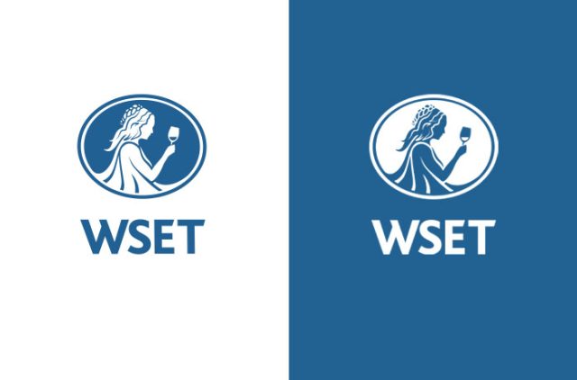
The Wine & Spirit Education Trust (WSET) is removing the figure of Ariadne from its logo and adopting a simplified identity, as part of a wider rebrand to reflect its broader scope beyond wine.
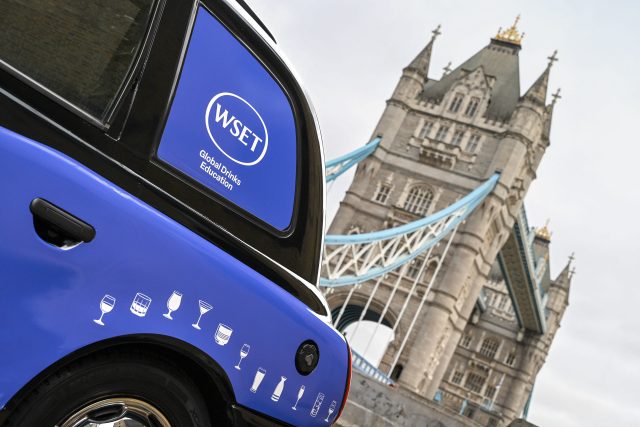
The changes, which were unveiled at the organisation’s annual graduation ceremony on 27 April in London, include a new logo, a revised strapline – ‘Global Drinks Education’ – and updated student pin badges. The organisation will also begin referring to itself primarily as ‘WSET’ – moving away from its full name.
Chief executive Michelle Brampton (pictured below) said the rebrand was intended to reflect how the organisation has changed in recent years, particularly its expansion into categories beyond wine.
“It’s not just how we look; it’s about how we talk about ourselves and how we relate to students and providers around the world,” she said in an exclusive interview with the drinks business, which you can listen to here.
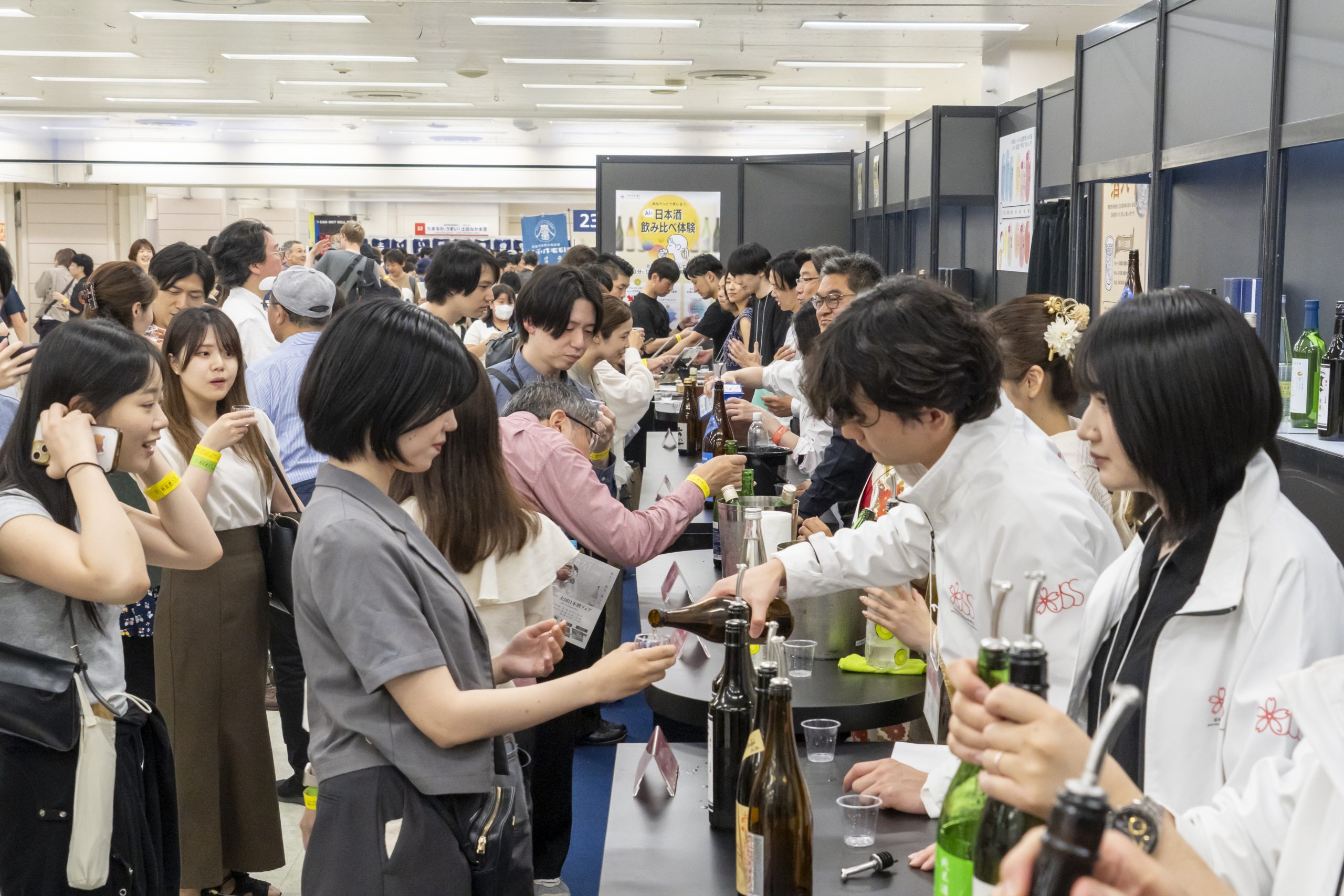
Founded in 1969, WSET has historically been associated with wine education. However, it now offers qualifications in spirits, sake and beer, with courses delivered in more than 100 countries and 15 languages. According to Brampton, the previous branding risked reinforcing the perception that the organisation was focused primarily on wine.
“The old imagery made us look quite wine-centric,” she said. “We needed something that better represents the full range of what we do.”
The removal of Ariadne – a figure from Greek mythology often depicted holding a wine cup – was part of that shift. Brampton also suggested the imagery could be seen as overly traditional.
“She’s a classical figure, and that can come across as a bit elitist,” she said. “We’re trying to be more accessible and more global.”
Partner Content


The new logo consists of a simplified wordmark, retaining the organisation’s blue colour and oval shape. The updated strapline is intended to make its purpose clearer at a glance.
“There was a previous line about being global leaders in education, but it didn’t really say what we do,” Brampton said. “This is more direct,” she added.
Other changes include redesigned lapel pins for students, now made with what the organisation says are more sustainable materials. The pins will use a colour-coded system to indicate qualification levels.
The rebrand also reflects a shift in how WSET presents itself more broadly. Brampton said the organisation has sometimes been perceived as academic or exclusive, something it is trying to address.
“We want to be seen as welcoming,” she said. “That’s about the language we use and how we engage with people.”
The updated branding will be introduced across WSET’s digital platforms from 27 April, with a full website relaunch planned later in the year.
The refreshed brand brings key changes including:
- A simplified name: WSET (replacing the full name, Wine & Spirit Education Trust)
- A modern, digital-ready logo that retains the heritage blue colour and oval shape – honouring WSET’s history
- A new strapline, Global Drinks Education, reinforcing WSET’s worldwide reach across wine, spirits, sake and beer
- Refreshed student pin badges using sustainable materials, with a clear colour-coded system to distinguish levels – bronze for Level 1, silver for Level 2, gold for Level 3, and black for Level 4 – alongside imagery representing different drinks categories
Related news
WSET’s Michelle Brampton on the future of drinks education