Quinta do Noval unveils new look for range
A selection of 13 Ports from Quinta do Noval have new packaging, prioritising premium details and a cohesive identity.
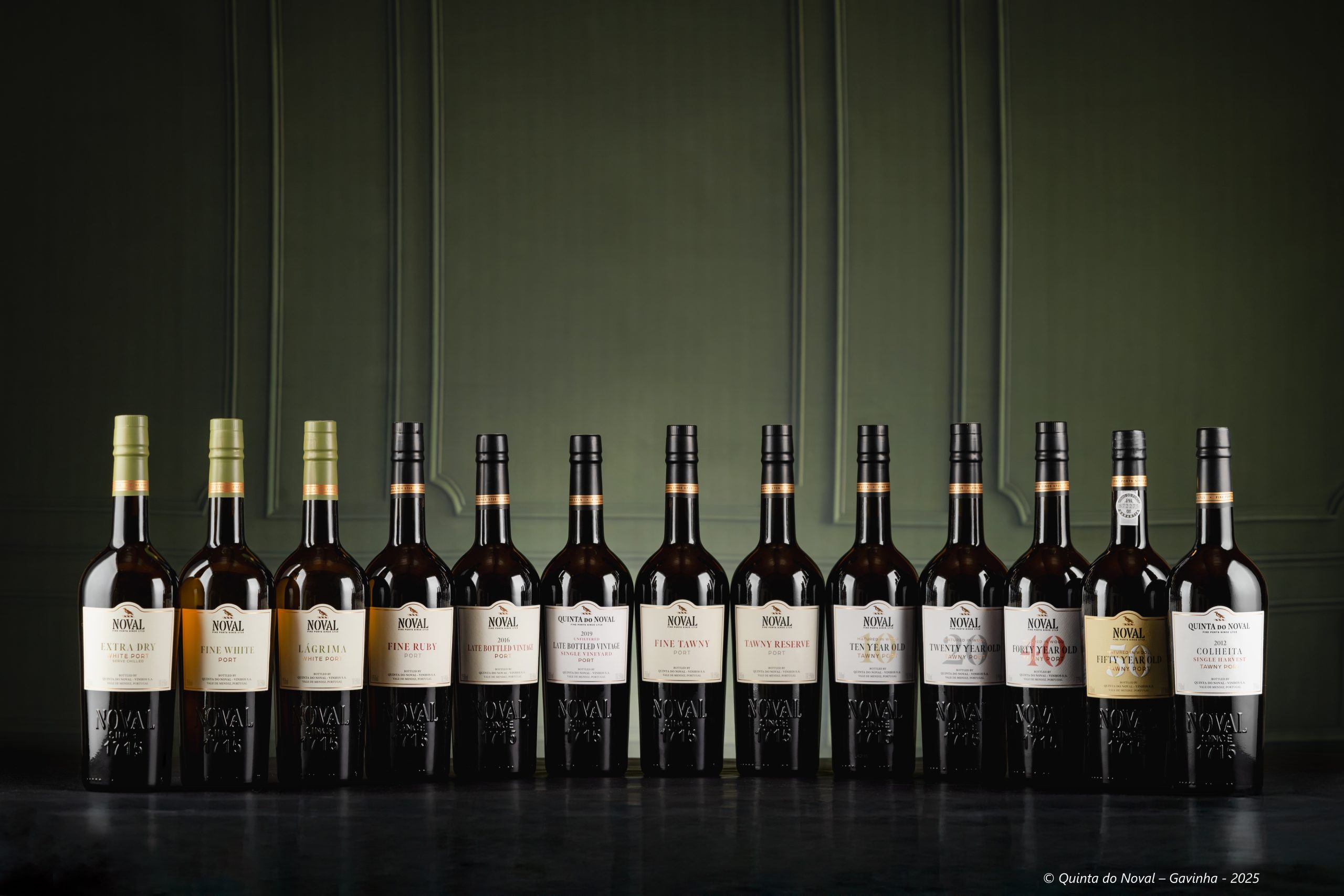
Across a range featuring white, ruby and tawny Ports, Quinta do Noval has revealed a new design for its bottles. The new look is described as a ‘modernised’ feel while still retaining key elements of the brand identity.
The producer has kept its embossed detailing, referencing the estate’s first appearance in land registries in 1715. It also still proudly displays the Quinta do Noval logo on each bottle.
However it has updated the capsules, using the same ones for the entire range. The choice was made for its harmonious effect, with white Ports in pale green and ruby and tawny Ports in black, but all unified by a distinctive gold band. By using the same capsule across the range, there is also less packaging waste.
Partner Content
Other choices in the redesign include subtle colour variations according to the style of wine and the using of large background details to signify the ages of the tawny Ports.
Among the bottles to benefit from the redesign is the Quinta do Noval Fifty Year Old Tawny Port. The bottling, the first of that age statement from the producer, was revealed in October.
At the time, Christian Seely, managing director of Quinta do Noval, described it as “a supreme expression of the Noval style of Tawny Ports and a culmination of our constant pursuit of excellence.”
Related news
Exploring the 'living heritage' of Château Sainte Marguerite
How B Corp can cut through 'a lack of literacy around sustainability'