MARKETING DESIGN & PACKAGING – Really Saying Something
Whichever consumer tribe you are targeting – Brand Dependents, Experimental Enthusiasts or even those In the Know – first impressions last, says Penny Boothman
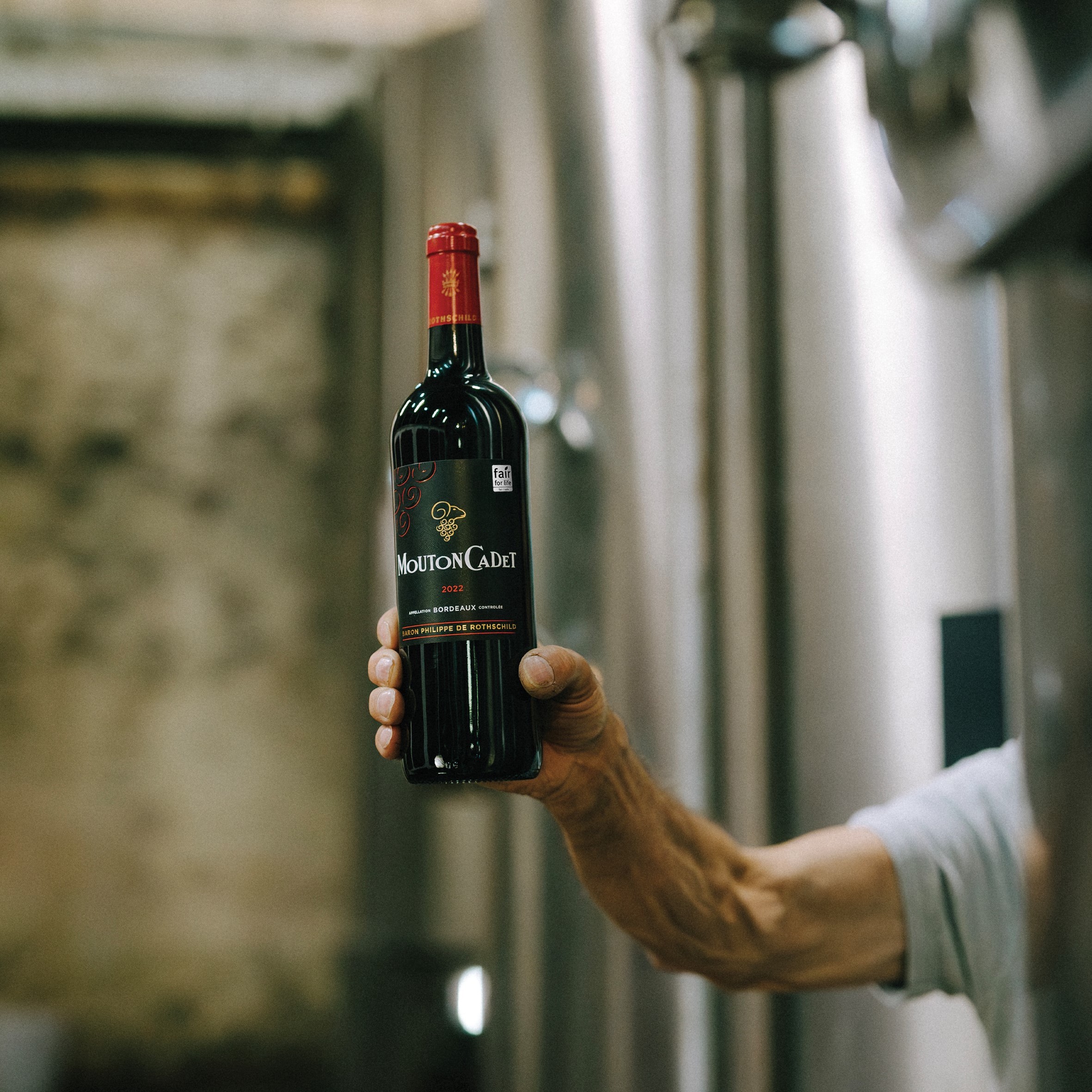
We all know you are not supposed to judge a book by its cover, but at one time or another, even if we will never admit it, we have all bought something just because it was in a “nice bottle.” Living rooms throughout the 1970s were lit by Chianti fiaschi with candles stuck in them. Now packaging is now an important weapon in the fight for sales in the overcrowded, highly competitive drinks market. Why? Because the average consumer spends less than a minute deciding which bottle to grab off the supermarket shelves.
“The first sip is with the eye,” says John Blackburn, who runs his own packaging design consultantcy, Blackburn’s. “At its best, packaging is the ultimate expression of the product it contains.” Blackburn’s has been inventing new images for international wine, spirit and soft drinks companies for 30 years, creating such icons as the blue Harveys Bristol Cream bottle. “It’s an integral part of the market mix,” Blackburn says. “It also supports the brand 365 days a year – cost that in advertising spend! It’s what people readily associate with a brand long after the ads have disappeared.”
This is the fundamental point. In the modern drinks market, packaging is more than a convenient container to transport and store your drink in: it is a walking, talking, permanently visible advert for your product. Kevin Shaw, MD of Stranger and Stranger, says: “Of course I’m going to say [packaging is] vital. PR, advertising, sponsorship and product placement can all play an image-enhancing role, but packaging is without a doubt the most cost-effective.”
Packaging is the first opportunity to catch the consumer’s eye, and if they like it, good packaging gives them an easy point of reference for a repeat purchase. Shaw says: “Packaging design isn’t art, it’s persuasion about function and personality, what the product does and what it says about the purchaser. We help to get you the first sale. The second sale is up to the product. You need to get inside the head of the consumer, and for that you need research.”
This makes sense: if you are designing a package specifically to appeal to a certain consumer target base, then you need to know what it is they are looking for. Research is as vital in packaging development as it is in product creation. Allied Domecq Wine UK has been researching the so-called premium wine consumer – those who are willing to break the £5 barrier – and some of the findings are surprising. Two key clusters, the Brand Dependents and Experimental Enthusiasts, together account for over 60% of premium wine consumed, and more than 55% of those drinkers claim that the bottle is one of the most important cues used in making a purchasing decision.
Sally Warmington, marketing controller at Allied Domecq Wine UK, says: “In particular, the Brand Dependents need confidence and clarity regarding varietal and country of origin, while the Experimental Enthusiasts look for quality and inspiration through regional provenance and product stories. Only among the most confident drinkers, the In the Know segment, was the bottle seen as relatively unimportant.
“For the majority of wine consumers their final decision is made at point of purchase. As a result, packaging that delivers impact and stand-out at fixture, while conveying the required information, flavour and style cues, is vital.”
Allied Domecq’s new Spanish brand, Albor, uses a colourful screen-printed bottle and contemporary styling to create a point of difference in the otherwise fairly conservative Spanish sector. Warmington says: “In many cases, given the relatively limited advertising budgets available for wines, this is the main contact point for consumers with the brand.”
Creating stand-out on shelf
is important, but designers have to stay within the consumer’s comfort zone for that product. Guy Douglass, client brand services director at the design agency FLB, says: “Consumers know so little about wine that I think you have to work harder to educate them about the brand than you do in any other market. If you were going to launch a really wacky branded wine in a Tetrapak then it wouldn’t be as easy as launching an orange juice in a Tetrapak. The snobbery around cork versus screwcap is a good example. It’s heritage and history versus function.”
Each category has an unspoken language of its own that gives the consumer an expectation of the product, so packaging needs to be saying the right things. For example, Sophie Greenup, new business development director at the design consultancy Ergo, says in milk, “everyone knows that green is semi-skimmed, blue is full cream, and red is skimmed.” How many of us have opened a blue bag of Walkers crisps only to find cheese and onion flavour inside instead of the salt and vinegar we were hoping for? And German wines come in tall green bottles. Don’t they?
When the existing category language is not the image of the product that the brand owners want to portray, packaging design can be used to challenge preconceived ideas. Liz Stich, Reh Kendermann’s export director for Europe and overseas, says: “The Bend in the River range was first launched in 1997 and was designed to present an exciting and different wine – a refreshing, modern style to appeal to more design-conscious consumers.”
Hans Berktold, joint managing director at Reh Kendermann, says: “The pack design is the first line of communication to our target consumers and represents the character and lifestyle image of each of our brands. Most importantly, the pack design must have enhanced shelf stand-out and appeal, but it must also correctly
portray the wine style, so consumers understand what they are purchasing and can purchase with confidence. Each of our brands, Black Tower, Kendermanns, The Bend In The River, River Route and our new Val Duna range, has its own identity and personality, which is reflected in the pack design.”
Partner Content
The “funny-shaped bottle” idea can have a tremendous impact on consumers and even spark a season of ridiculous haircuts. Boyar Estates’ Andrew Lamberth, talking about the sloping-sided Blueridge bottle, sales of which saw a 40% rise in the first year after its redesign, says: “Bulgaria’s one of those places where people don’t expect to see innovation, so we wanted to prove them wrong. When they see that the packaging is as contemporary and distinctive as it is, they realise that the wine itself is also likely to be modern in style.”
A packaging redesign can be a useful tool when sales could do with a boost. Ergo was responsible for creating the modern rugby-fuelled identity of Tetley’s Bitter, giving the very traditional brand a facelift and a more modern appeal through its packaging. Stuart Mackay, strategic partner at Ergo, says: “What they wanted to do was bring Tetley’s up from being just flat caps and whippets to being a national brand, and they’ve seen a 500% off-trade sales rise in five years.” There are few products that say more about the person drinking them than beer, so getting the image right is crucial.
The brand design agency FLB gave San Miguel a new gold label. FLB’s creative director, Colin Mechan, says: “We spent a long time understanding what kind of gold it should be. San Miguel is a brand with a lot of emotive baggage. What makes it different from Grolsch and Becks and all the other Northern European beers is that they’ve all got green glass, and San Miguel has brown glass, the visual refreshment cues were different, so we decided to build on that.” Creating a point of difference is all important, even when the new look is not a radical departure for the brand.
New beginning
However, in some cases a successful bottle redesign can create a whole new beginning for the product. Cobra’s recent launch of the new Cobra Story bottle made a dramatic impact on the image of the brand. Simon Edwards, marketing director for Cobra beer, says: “The response has been amazing. The launch was 18 months ago and we now have 6,000 mainstream accounts, when we had just a handful before.” He credits the redesign with broadening the appeal of Cobra and establishing it as a beer in its own right: “Packaging appeals to the sense of touch as well as the eye, and this is what we’ve tried to achieve with Cobra. It looks attractive on the bar, but also when you pick it up you get a feel for the quality. We’re up against the likes of Carlsberg and Budweiser and we don’t have anything like their budget. So putting the story on the bottle all the way round was something that hadn’t been done yet, and we pushed the boundaries a little to get the glass manufacturer to push themselves and they obviously did a tremendous job.”
Rockware Glass, the company that was responsible for creating the unique embossed bottle for Cobra, sees every one of its clients trying to get that extra bit of stand-out on shelf to edge ahead of the opposition. Sharon Crayton, Rockware’s marketing manager, says: “Innovation is a key issue for our customers, and they are looking to their major packaging suppliers for new approaches and ideas. We use a range of different research techniques and methodologies to develop a closer understanding of consumer perceptions and requirements from packaging. Innovation featured very high on the list of priorities in Rockware’s 2004 Customer Perception Survey.”
Instant recognition
Another packaging specialist, Rexam Glass, which recently reworked the Bacardi bottle, agrees. Tim Shearer, glass sector marketing manager at Rexam Glass, says: “Packaging is very important to a brand’s image and value. A strong and distinctive shape can become an unmistakable part of a brand’s profile and establish recognition among consumers. For example, Coke, Absolut and Marmite are still all instantly recognisable without their labels and imagery. Brand owners are increasingly recognising the value that packaging can add to a brand proposition and its identity. By taking such an approach, sales of brands can be positively driven and returns from marketing expenditures maximised while achieving competitive advantage.”
“There is a constant cycle of bringing a wine brand up to date,” says Abigail Barlow of marketing and design specialist Barlow Doherty. “The top brands are the ones becoming most similar in terms of design and are looking to strengthen their brand to make it more memorable and easier to read. They’re all quite safe designs at the moment and ultimately wine brands are about reassurance.”
But packaging these days is about more than just bottles: the labels on them also provide an important point of reference for the consumer. Alex Mulvenny, MD of Label Graphics, says: “The future for drinks labelling is looking very good, as production is becoming faster and more competitive. The new clear-on-clear labels give the impression that the design has been printed straight onto the glass.”
The bag-in-box market is also growing rapidly. David Aston, business development director at the BIB specialist WSPC, a division of the WineBox Company, says: “The flat sides of a BIB present a tremendous area for marketing the brand.” Even more so than sticking a label on a bottle, this is a cost-effective way of creating your own billboard, and consumer perception of bag-in-box wines is improving, with the likes of Hardys’ Stamp series now in cardboard.”
Packaging has never been so important to the drinks industry as a means of getting your product noticed and generating sales. Advances in technology mean that designers now have an infinite range of possibilites to work with and innovation is everywhere. But with everyone trying so hard to be different, who will really have the point of difference?
© db May 2005