How Port got its groove back
An increase in sales confirmed that a comforting glass of Port was just the ticket during lockdown. But to fortify this classic convincingly, it needs a brand new identity, says Denomination’s CEO, Rowena Curlewis.

For some time now, Port has been on a mission to shed its fusty image as an after-dinner sipper, only to be enjoyed during the final month of the year. And there’s evidence that this famous fortified wine from Portugal’s Douro Valley is having some success.
The media is full of stories about Port’s revival. That it has become a hit with millennial consumers. That it tallies with a renewed fascination for all things Portuguese. That mixologists – the rockstars of the bar world – have been reinventing old classics with the addition of Port. And that Porto tónico became a summer classic to rival the ubiquitous G&T. Just a few years ago, Croft Port, which was founded in 1588, even launched a rosé version to be enjoyed over ice in the summer.
There are all kinds of reasons for these trends. One could be that Port comes in so many guises – white, ruby, vintage, LBV, tawny, colheitas, rosé – so there’s lots of room for experimentation and adaptation by new generations of drinkers. Such a portfolio begs to be used over myriad user occasions and at different times of year.
Another could be that cocktails have been a big growth area, on- and off-trade, for a few years now. The soaring popularity of Aperol Spritzes, Negronis, Mojitos and Espresso Martinis shows just how far the average drinker’s palate has come, and that the quest for new, more nuanced flavour profiles is likely to continue.
The continued love of all things vintage could be playing its part, too, as more of us question the modern throwaway culture and look to reuse, restore and revive. Carefully crafted, cleverly updated cocktails from a bygone era seem more suited to the preloved-fashion and vinyl-record trends that are becoming ever more mainstream. Some of us just want to ‘unplug’ and slow down.
But despite all these trends, and the endless efforts of the producers and marketers of fortified wines, perhaps the biggest impact has come on the back of the pandemic. Back in March 2020, many people retreated to brands and products that made them feel safe and secure. We seek familiarity and comfort in times of change.
Old films and favourite albums are rediscovered in search of cosy nostalgia. The latest Port Wine Institute statistics show Port progressed by 3% during lockdown, with the premium categories holding their position. This has been driven by the increase in online sales and through the support of local communities for independent outlets.
Partner Content


It’s the category’s versatility and constant reinvention that will ensure this positivity continues, however. One of the most effective ways to achieve this is to shift the way people see you. Do something different with your packaging, be disruptive, grab the attention of both consumers and bartenders. You can take inspiration from other drinks categories – as Graham’s Blend No. 5 did with gin, for example – but at the same time make sure you’re unique.
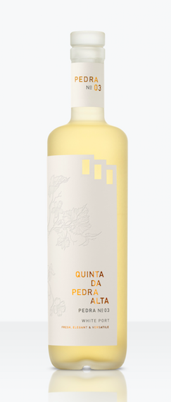
Smart brands were quick to take advantage of the fascination with Portugal and Porto tónico. As well as the radical redesign of Graham’s white Port, Quinta da Pedra Alta No. 3 disrupted the category with new label technology that showed the delicate liquid shining through the equally delicate botanical illustrations on the label. With consumer uptake almost immediate, other brands saw an opportunity to continue this disruption through packaging design, including brands such as All Saint’s graffiti-style Hip Sip.
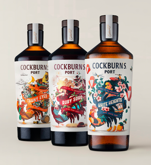
However, it took Symington Family Estate’s new launch of Cockburn’s Tails of the Unexpected to bring innovation to both product and packaging design. The liquid in the three Tails of the Unexpected varieties has been crafted to be used specifically as a mixer in cocktails. The packaging is equally brave, especially from a heritage brand such as Cockburn’s. The method of launch, at pop-ups in Falmouth and Brighton, underscored the deliberate targeting of Generation Z and millennial consumers, introducing them to a whole new category.
Gen Z and millennial audiences have grown up in a somewhat crazy world. But they see through marketing hype a lot faster than other generations. They crave authenticity and credible stories. Brands that have a history provide both, and a vintage design execution marries nicely into this need.
It’s important, however, that there is a real connection to the past and a real story. Otherwise it can come off as yet another marketing ploy. Cockburn’s Tails of the Unexpected is vintage in its execution, but every part of the illustration has connection to a real story. White Heights depicts Porto’s city-seaside life, with its iconic vintage trams, statues, flora and fauna.
Ruby Soho takes us to London’s louche West End, with burlesque dancers and jazz fans enjoying a retro Port and lemon. And Tawny Eyes portrays maverick winemaker John Smithies, and a ship sailing from Porto to the London Docks. The famous cockerel makes an appearance on each label in his guise as either a mixologist, jazz trumpeter or reveller, bringing the character of the brand and each variety to life.
Fusty brands that have not kept up with the times tend to get forgotten by consumers, lost on shelf among the dynamism of many of their drinks competitors, and ignored by trade. A radical packaging change and brand repositioning provides the stimulus for consumers and trade to re-evaluate their opinions, or even notice the brand once again.
Related news
How one Port powerhouse is pushing beyond fortified