How to ensure your product doesn’t appeal to kids
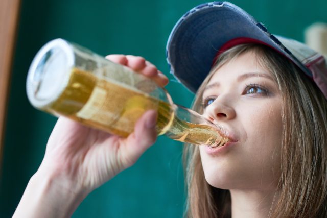
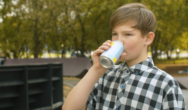
An audit by regulatory body The Portman Group found that 94% of products complied with “responsible” alcohol marketing guidelines in 2025. However, most breaches related to designs having “particular appeal to under-18s”. Here’s how to make sure your alcoholic drink does not look tempting to children.
Last year, The Portman Group announced it was undertaking its first ever audit to evaluate the effectiveness of a self-regulatory model for responsible alcohol marketing. Now the results are in, and they are broadly extremely positive with 94% of the 500 products assessed from within the UK market in 2025 complying with the group’s guidelines. Products were randomly selected and weighted across all categories of alcohol according to market share.
However, the biggest number of breaches (eight in total) related to brands having “particular appeal to under-18s”. The issue was also the leading request for advice sought from the group’s free advisory service in 2025.
Murky waters
And while it might sound like common sense to create packaging designs that don’t stand out to minors, brands continue to swim in murky waters, whether that be through the shape of the container housing their liquid or the nature of illustrations or fonts used on drinks labels.
In September 2024, for instance, an Italian wine producer was forced to stop selling its Hello Kitty Pinot Noir in the UK. Despite Torti Wine, based in Lombardy, arguing that the Hello Kitty franchise “appeals to all ages”, including mothers and grandmothers, the alcohol industry’s Independent Complaints Panel (ICP) banned the product, calling it “wholly unacceptable”. Rachel Childs, chair of the ICP, added that it was a timely reminder that the Portman Group’s Code of Practice “applies to all alcohol marketed in the UK, and not just that of UK producers.”
Then there was Beak Brewing in Lewes, Sussex, which earlier the same year also had its wrist rapped for the underage appeal of its beer packaging, with owner Daniel Tapper calling the ruling against his company a “learning experience”. Cans of Beak Déšt’ Czech Pils were adorned with cartoonish or “anthropomorphised” illustrations that were found likely to entice under-18s.
Speaking to the drinks business, Laura Demorais, director of regulatory affairs for the Portman Group, gave her top tips for staying on the right side of responsible marketing.
Don’t be colour blind
“Cartoon-style imagery, childish fonts, bright colouring, personalities that are particularly admired by under-18s, pictures of real or fictional people known to children or terminology popular with children are all areas that producers should be particularly cautious with,” Demorais advised.
The issue of colour is an intriguing one as surely the interpretation of different shades is subjective? “While the inclusion of colours is not automatically a problem under the code, young children tend to be most attracted to bright primary or secondary colours and pay little attention to verbal messages,” she explained. “Bright colours are particularly stimulating to a child’s developing brain, and can evoke feelings of happiness and attract attention.”
However, it’s not only the colour itself that could prove problematic, as clarity can also feed into the picture. According to Demorais, “muted colours which have higher levels of contrast can also attract a child’s attention.”
Avoid cartoon appeal
While the Portman Group’s code acknowledges that not all characters are designed to appeal to children, “producers must be mindful that some characters, such as anthropomorphic animals, or characters with large eyes, smiling faces and welcoming stances are all likely to have an appeal to under-18s,” cautions Demorais.
“Even in an instance where the character itself does not have a particular appeal, a baseline is created where the packaging or marketing is already creating a certain level of appeal, even inadvertently, which can be exacerbated by other elements such as bright colours, flavours, sparkles etc.”
Clearly cartoons can evoke fuzzy warm feelings of nostalgia among adults. Who doesn’t remember television shows like Top Cat or He-Man from their childhood? And according to the regulatory body there is nothing wrong with nostalgic marketing when it is ” used to appeal to an adult age group and ultimately remind the target demographic of a well-loved theme, story, character, series, game etc. from when they were teenagers or children.” However, where care should be taken is when alcohol marketing includes “elements which were popular with children many years ago…” and “may still hold an appeal to children today.”
Choose your font carefully
Drinks producers should also pay careful attention to their choice of typography and font on a product. Why? Because “the keyline (or outline) on a font or characters is important for children to distinguish objects as they develop their visual perception skills,” said Demorais.
The thicker the keyline, she revealed, “the easier it is for a child to notice the font or character.”
Partner Content


Particular caution should be exercised around using “a bright primary coloured text, a chunky/cartoon-like font or words with high contrasting colours or thick outlines.”
Additionally, producers should tread carefully “when using playful or fun names. Eg. those that are onomatopoeic”, Demorais added.
Avoid novelty shaped containers
The vessel itself could also land drinks producers in hot water, with Demorais telling db that brands should be extra careful when using a novelty shape container or interactive packaging.
Elements such as “shaking or spinning the bottle to elicit an effect such as sparkling liquid, flashing lights or music all have the potential to appeal to children because of the similarities with children’s toys or entertainment items,” she said.
Examples of a product skating on thin ice in this respect are two ‘snow globe’ gin liqueur products created by Marks & Spencer. Spiced Sugar Plum Light Up Snow Globe Gin Liqueur and Clementine Light Up Snow Globe Gin Liqueur were both found by the Independent Complaints Panel (ICP) to have a particular appeal to under-18s. “In both instances the panel found that a combination of elements such as ‘toy’ like imagery, interactive features and novel packaging design combined created an overall impression that had a particular appeal to under-18s,” said Demorais.
In its ruling, the ICP stated: “The lights operate only for a limited time then need switched on again. One can imagine the ‘Do it again!’ cry from children, just as happens with a toy or Christmas decoration with a similar mechanism.”
Other retailers, including Aldi, went on to emulate the M&S snow globe design, causing a spate of court hearings and appeals over copyright infringement.
Steer clear of overly sweet flavours
While sweet flavours are not always a problem, Demorais outlined that “children tend to have a genetic predisposition towards sugary or sweet food flavours and initially reject sour and bitter tastes.”
As such, sweet flavours “create a level of appeal that brands need to bear in mind when considering how the rest of the packaging is marketed.”
Indeed, Demorais stressed that inclusion of any of the above elements mentioned in this article “is not inherently problematic under the code, but rather these are areas where caution should be exercised.” Some elements may be acceptable in isolation “but are not when combined with other elements and may create an overall impression which is over the line of acceptability,” she added.
The Portman Group encourages drinks producers to make use of its free and confidential advisory service for quick, bespoke advice (99% of requests for advice are answered within 48 hours).
Related news
Will the new EU free trade agreement open up India to fine wine?
Ruinart enlists Tadashi Kawamata for 2026 Conversations with Nature series