C&C reveals first new Tennent’s Lager can design in five years
C&C Group has unveiled a brand new look for its iconic Tennent’s Lager cans for the first time since 2018.
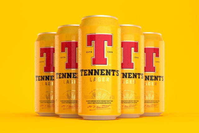
Tennant’s lager, known by many as Scotland’s best-selling beer brand, now has a new ‘visual identity’ that the brewer hopes is both modern as well as reflecting the brand’s heritage.
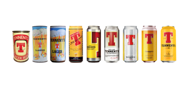
The redesign, led by the Thirst, aimed to build on Wellpark Brewery’s historic place in Scottish culture and its position as the founder of Scotland’s original pilsner brewed on the same site since 1885.
Speaking about the makeover for the cans, Thirst’s creative director Matt Burns said: “This project is a dream come true. There’s so much passion for the brand – from our team, from the Tennent’s team, and from everyone in Scotland. We poured all of that into the design. It was essential we put the heart that goes into Tennent’s Lager onto the can. We re-visited the beloved iconography, adding depth and richness, and introduced new markers to tell the story of the quality and skill that bring the lager to life and re-energise the brand.”
Burns explained: “Scots are known for their optimistic outlook and the brand has always leveraged that energy to create uplifting, meaningful brand conversations. We set out to celebrate and amplify the position that Tennent’s represents in Scottish culture and beyond.”
Partner Content
C&C’s brand and marketing director (Beer) Paul Menzies, said: “Tennent’s Lager is one of Scotland’s most important and enduring brands. When approaching an evolution of its visual identity, we wanted to respect that history and heritage whilst looking to embrace more current trends and design elements.
Menzies added: “This is not so much a revolution, but an evolution, and everything that is immediately recognised about Tennent’s Lager is still featured within the packaging and design. We want to make the arrival of a new Tennent’s Lager can an event to get people talking.”
The new cans have been developed to lean into Tennent’s Lager’s quality with a richer yellow to amplify a bolder red ‘T’ brandmark at the heart of the can and features a new barley motif to help echo the words: “Fresh Highland water, barley from local Scottish farmers and the perfect balance for Herkules hops” that are also present on the can along with Hugh Tennent’s signature.
The new Tennent’s Lager design will roll out throughout Scotland and beyond in the coming days across its full packaged range and coincides with limited edition glassware featuring illustrations by Tobias Hall.
To support the redesign, C&C group is also investing in the launch of Tennent’s biggest marketing drive in eight years, which will feature a new TV advert as well as out-of-home advertising and a social media campaign.
The new look for Tennant’s Lager is the first piece of work under the Tennant’s brand’s new platform ‘Raised in Scotland’ and, according to the group, is set to “guide the brand for years to come”.
Related news
#WeekInPictures: the Queen visits Plumpton as craft beer and rum move into new territory