Top 10 wines from The Global Design and Packaging Masters
Following The Global Design and Packaging Masters last month, we bring you our top 10 from the competition, taking in a rosé with textured glass, a ‘topless’ Champagne, a pink wine pouch and a Portuguese white blend with a word search, among other novel packages.
The following designs were all taken from the competition, which you can read more about below. While to view all the medallists from The Global Design and Packaging Masters, please click here.
MIRABEAU PURE
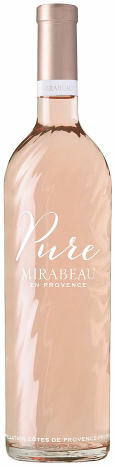
The judges were highly impressed by this new look for Provençal rosé Mirabeau Pure, praising its “distinctive” and “upmarket” appearance. Featuring textured glass, designed to mimic the “soft and regular waves” of the nearby Mediterranean sea, the sculpted, flat-bottomed bottle marks a departure from the smooth finish of the previous package, which once had a punt. Beautifully crafted, with a fine coppery pink capsule, and branding applied cleanly and directly on to the bottle, this was deemed a Master of drinks packaging – gaining Mirabeau Pure the top award of the competition.
FIOL PROSECCO
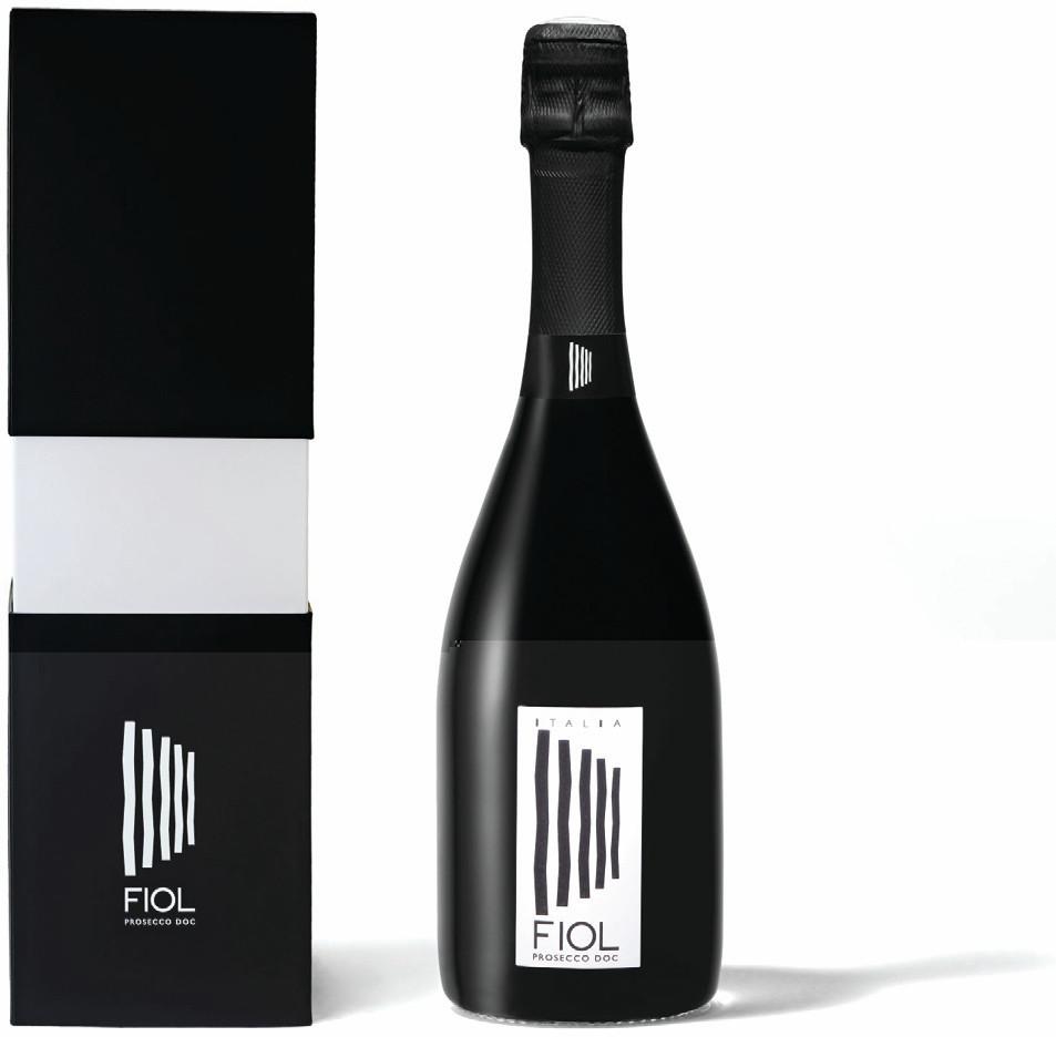
“Bold”, “different”, and “modern” were just some of the words used to descript this bottle and gift box from Fiol Prosecco. Unusually for sparkling wine, the packaging is entirely finished in black and white, making it striking, and encouraging all the judges to mark Fiol highly for its ability to stand out on the shelf or bar. The product was also praised for the quality of the finish, with plenty of positive remarks for the detailing and feel of the packaging.
CHAMPAGNE TELMONT
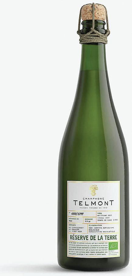
Lauded by the judges for taking a Champagne house “into a new visual territory”, the pared-back look and feel of Telmont’s Réserve de la Terre was deemed an exciting and attractive design departure for the famous French sparkling. Doing away with a gift box and capsule, the ‘topless’ design was declared both brave and environmentally friendly for a Champagne, although the look and feel of the product still feels upmarket, with fine paper stock, a lovely closure, and touches of gold. Finally, the Champagne house was congratulated for printing so much useful product information, making its front label appear as though it were a back label, meaning that it should appeal to the Champagne specialist retailer or sommelier.
LA PIU BELLE CHAMPAGNE
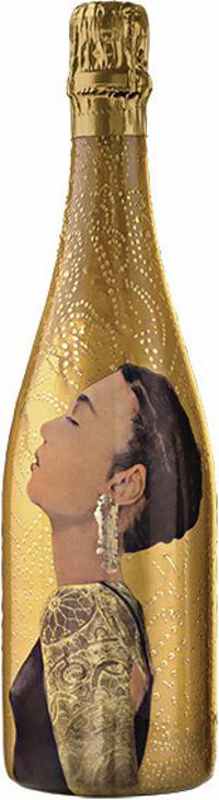
Made in collaboration with Russian artist Elena Trailina, this VIK Champagne, called La Piu Belle – meaning ‘the most beautiful one’ – continues in a line of packages from the producer that features works of art. While it is undoubtedly showy, one of the judges in particular felt that it conveyed “a real feeling of luxury,” with both “opulence and emotional pull”.
PEQUENO DILEMA
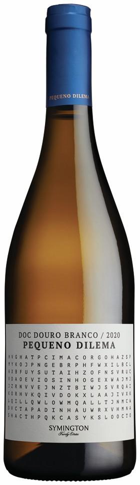
Featuring a word search on the front label, Pequeno Dilema – meaning ‘little dilemma’ in Portuguese – was named to reference the predicament of creating a fine and delicate white in the Douro, which is famous for producing powerful fortified wine, Port. If you are struggling to find the terms in the word search, you can log on to the brand’s website to see the answers, encouraging consumers to find out more about the blend. The judges were impressed by the design, declaring it “original” and “an inexpensive way of doing something different”, as well as something that was “fun”, “clever”, and would “drive engagement”.
LE CHENIN DE MERCUÈS
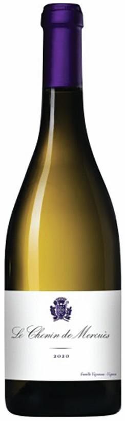
With its “regal” purple capsule, and “classy”, “clean” and “understated” appearance, the judges felt that this bottle was brilliantly and gracefully designed to suit an upmarket setting, such as a fine dining restaurant or luxury-drinks retailer. Using Chenin Blanc from the incredible gothic château and estate in Cahors, Château de Mercuès, it’s an unusual wine that doesn’t feature the region or grape variety on the front label, but conveys a fine-wine positioning through its elegant appearance.
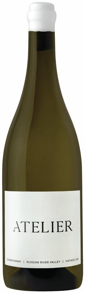
ATELIER CHARDONNAY
Partner Content

Winning praise for its “well-executed”, “upmarket”, “minimalist” look was a new pair of wines from Russian River Valley in California’s Sonoma County. Called Atelier, the judges liked the designs for both the Chardonnay and Pinot Noir, although they slightly favoured the former. With its simple, typographic label, and pared-back appearance, it was felt that this brand looked smart, was distinctive, and “made you want to drink it”. It was also congratulated for using a Californian-made sub-500g bottle, recycled paper, biodegradable inks, and a domestically sourced biodegradable wax capsule.
BIJOU ROSÉ
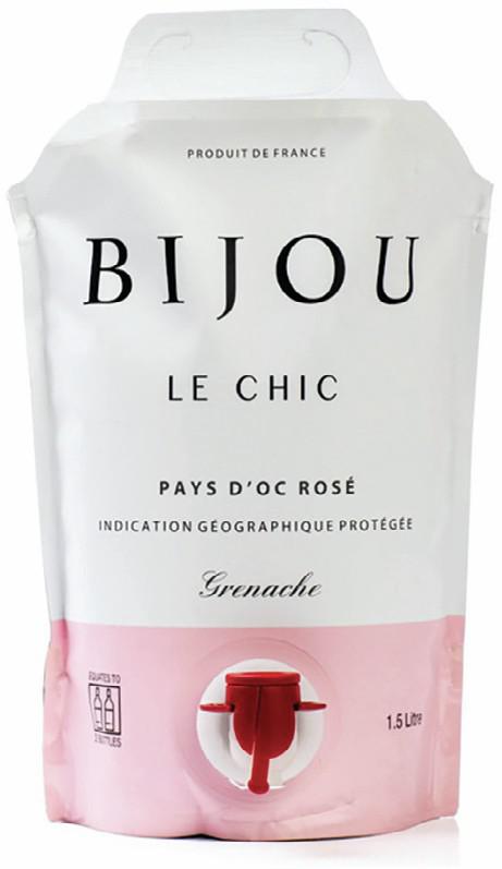
This “simple” and “practical” wine pouch was praised by the judges for its “premium feel” and “clear branding” – with the brand, the region and the grape variety all prominently stated, along with an “excellent explanation” about the benefits of buying wine in this format. While the judges liked the finish and the fonts, they were disappointed that the tap for dispensing the wine wasn’t finished in pink to match the rest of the branding, and wondered whether the entire package was recyclable.
TERRAZAS DE LOS ANDES
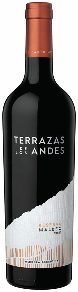
The judges were impressed by this new look for Argentina’s Terrazas de los Andes, which has immediately made the old bottle looked dated. Deemed “original” and “striking”, the design, which has been created to emphasise the high altitude of the producer ’s vineyards, was also called “clever”, and effective when it comes to “illustrating the story”. Terrazas de los Andes was also praised for using a relatively lightweight bottle by Argentine standards, despite the brand’s upmarket positioning.
PENFOLDS TRAVEL RETAIL PACK
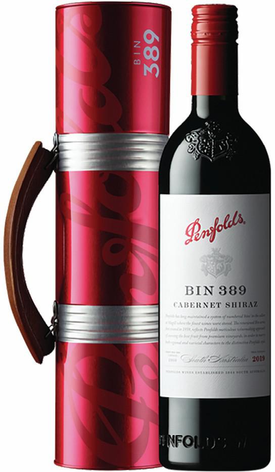
Declared “a great idea” that was both “highly gift-able and communicates the brand strongly”, the Penfolds Travel Retail pack has been designed to make it as easy as possible to take a bottle of this famous Australian wine with you when journeying. It uses real wood for its handle, and a tin canister, and although it represents additional packaging for the Penfolds product, it was not considered unduly heavy, and it is designed for repeated use.
About the competition
The Wine Design & Packaging Masters was judged on 17 January at the Novotel London Bridge, London. It is one of 25 competitions in the Global Wine Masters 2023, and the first to judge entries on design. Wines in a wide variety of packaging styles were evaluated by a criteria of aesthetics, functionality and sustainability.
The entries were given medals from Bronze to Gold, with the very best being awarded the title of Master.
Assessing the entries this year was Patrick Schmitt MW, buyer Jonathan Pedley MW, wine writer and drinks consultant Douglas Blyde, and Neil Tully MW – founder and creative director of wine industry design and branding specialists, Amphora Design.
More information on this competition is available at www.globalwinemasters.com or by emailing Sophie Raichura at: [email protected]
Read more
All the medal winners from the Global Wine Design and Packaging Masters
Top design accolade for novel wine label that illustrates a dilemma
Related news
Do global awards actually drive Japanese wine sales?