Best Design & Packaging 2007
William Grant & Sons – Monkey Shoulder
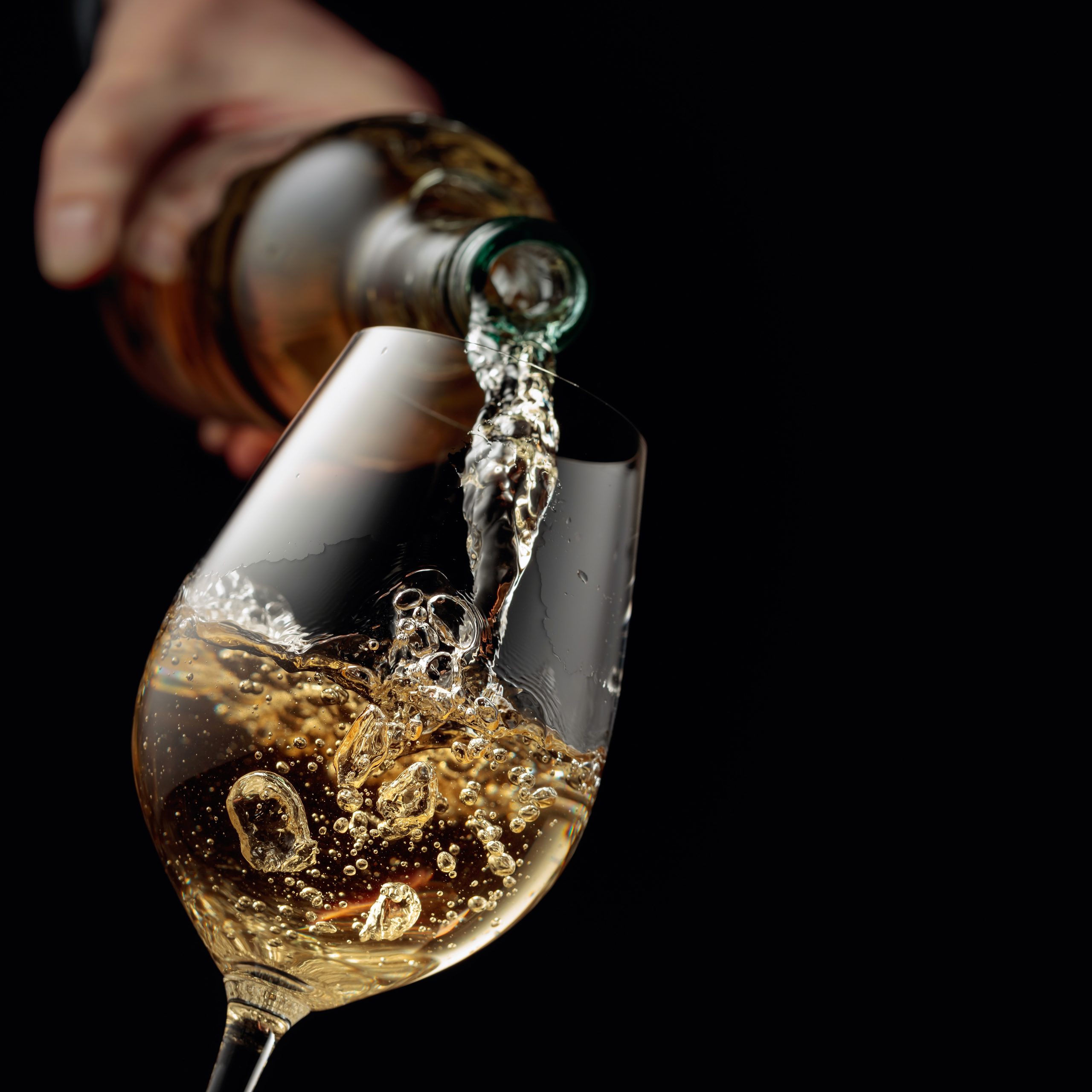
Monkey Shoulder must have been a difficult brief for designer Lewis Moberly. It was created with a young, “marketing savvy†audience in mind and inspired by the posture of distillery men, formed after years of turning barley by hand. “It had to balance the unexpected with the familiar,†explained Mary Lewis, design director at Lewis Moberly, “in a category where most brands do one, or the other, to a fault.â€
So what did the packaging specialists come up with? A clear, simple and modern label which explained the story behind the name. This was visually reinforced by the appropriate positioning of three polished pewter monkeys on the shoulder of the bottle.
Perhaps needless to say, judging by the whisky’s presence in back bars around London, the design has quickly caught the trade’s imagination, and also, crucially, the end consumer’s.
It was felt by the judges that Monkey Shoulder had “bridged a gap between Bourbon and Maltâ€, and “really stood outâ€.
Partner Content


The whole package was clearly the result of painstaking research – the designers had really got under the skin of the brand concept. Furthermore, the finished product was beautifully executed and looked as though it had a history. As one judge said of the brand, despite the fact it is entirely new, “Monkey Shoulder has got real depth to itâ€.
| Â {playerflv}http://www.drinksbusinesstv.com/images/videos/Awards_07_design_and_packaging.flv|320|280|#ffffff|true|right{/playerflv} |
| THE SHORTLIST 2007
Boutinot/Dare! – Chat-en-oeuf Chivas Brothers – Longmorn 16 year old |